Thumbnail design that makes your video’s idea clear
Build custom YouTube-style thumbnails around your real face, screenshots, products, and exact wording—then refine the look with plain-language feedback in Thumbnail.AI.
- personYour face
- add_photo_alternateYour source images
- edit_notePlain-language edits
What makes a strong thumbnail design?
A strong thumbnail design communicates one compelling idea before a viewer reads the title. It usually combines a clear focal subject, a readable visual hierarchy, an expressive face or recognizable source image, and only a few high-impact words. Thumbnail.AI helps you turn that direction into a custom starting point using the assets and wording that belong to your channel.
For YouTube creators, channel designers, editors, and teams creating videos that need a consistent, recognizable visual approach.
Three thumbnail ideas for thumbnail design
Each example explores a different visual direction and can be adapted with your own face, images, wording, and brand.
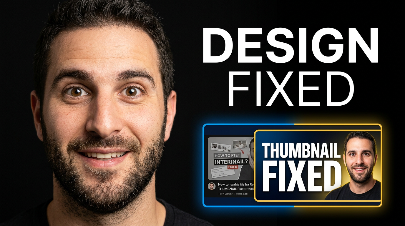
Design tutorial reveal
A transformation-focused composition for a thumbnail design tutorial.
See the visual approach
Close-up male creator with a surprised, confident reaction on the left, facing a large polished before-and-after thumbnail comparison on the right. The before side is muted and cluttered, while the after side is crisp with strong contrast and a clean focal image. Dark charcoal studio background with bright electric blue and warm yellow accents, dramatic cutout lighting, clear visual separation, energetic instructional mood.
Make a thumbnail like this →
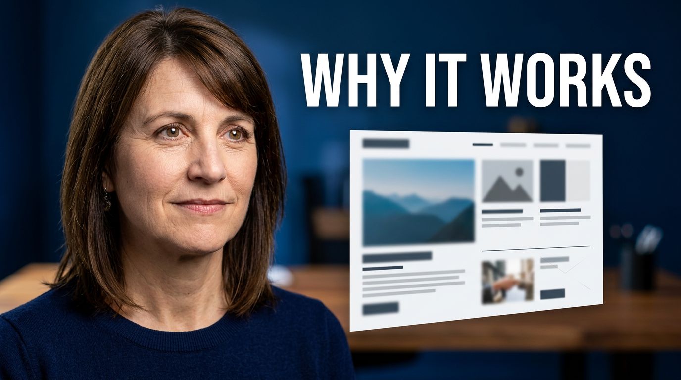
Creator workspace breakdown
An editorial setup for explaining the decisions behind an effective design.
See the visual approach
Female thumbnail designer at a modern creative desk, looking toward a floating layout board that shows large image blocks, simple contrast cues, and a clear focal structure without legible interface text. Soft daylight, warm desk materials, tasteful blue and coral color accents, composed expert expression, polished editorial framing, spacious and professional mood.
Make a thumbnail like this →
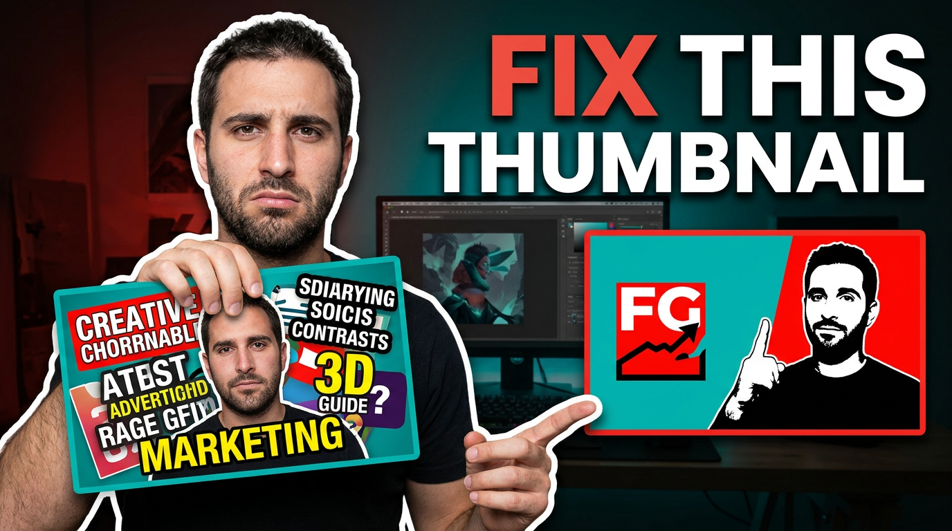
Thumbnail redesign challenge
A direct critique format built around a clear problem and visual improvement.
See the visual approach
Male creator in the foreground holding a messy, overstuffed thumbnail mockup with an unimpressed expression, while a bold simplified redesigned concept appears prominently beside him. Strong red versus teal contrast, oversized visual focal point, clean cutout silhouette, punchy studio lighting, direct critique energy, clear emphasis on clutter versus clarity.
Make a thumbnail like this →
These examples are starting points. Results vary based on your images, wording, and creative direction.
Thumbnail design decisions that matter
Use these principles when shaping a thumbnail for a tutorial, review, commentary video, vlog, or launch announcement.
- Choose one visual promise for each video rather than illustrating every detail.
- Make the main person, product, result, or before-and-after contrast immediately recognizable.
- Use large, limited text that supports the image instead of repeating the entire title.
- Create separation with contrast, lighting, outlines, or a simple background—not visual clutter.
- Keep important faces and objects away from corners where platform interfaces may overlap.
- Reuse familiar colors, framing, and type treatments so returning viewers can recognize your channel.
- Start from your own screenshots, product photos, portraits, and brand elements when accuracy matters.
- Review the design at a small size before publishing; the focal idea should still be obvious.
A simple workflow you can reuse
-
1
Bring the key assets
Upload the portrait, screenshot, product image, or reference material that should appear in the design. Use your own face when your reaction or expertise is the focal point.
-
2
State the visual direction
Describe the scene in everyday language: what should be large, what should feel urgent, what should stay minimal, and what mood fits the video. Add the exact short wording you want visible.
-
3
Refine for the video’s promise
Ask for targeted revisions such as a tighter crop, brighter product, cleaner background, stronger contrast, different expression, or a more premium editorial feel.
Frequently asked questions
Answers for building a useful, repeatable thumbnail workflow—not just generating one image.
Browse all thumbnail makers →
How much text should a YouTube thumbnail include?
add
Usually, a short phrase is easier to scan than a full sentence. Keep the wording focused on the tension, result, question, or payoff, and let the video title provide the detail.
Can I use my own photo in a thumbnail design?
add
Yes. Upload a portrait or source image and direct how it should be used—for example, as a close-up reaction, a cutout beside a product, or the central subject of a tutorial thumbnail.
How do I make a tutorial thumbnail look clear instead of crowded?
add
Lead with one visible outcome: the finished design, a decisive tool screen, or the instructor’s reaction. Reduce secondary interface elements and use text only to reinforce the main takeaway.
What should a thumbnail designer provide to a creator or editor?
add
Share the intended video angle, the exact thumbnail wording, required source images, brand colors or references, and any elements that must not be changed. This keeps revisions tied to the video’s actual promise.
Can I keep a consistent channel style across different video topics?
add
Yes. Reuse a recognizable combination of framing, color palette, type treatment, and subject placement, while changing the central image and visual hook to suit each individual video.
Turn your thumbnail direction into a custom design
Upload your source images, add the exact words you want shown, and describe the visual treatment you have in mind. Keep refining until the thumbnail fits the video.
Create a thumbnail in Thumbnail.AI